
A certificate has to read as issued rather than printed off at a desk. Stock, finishing and layout do that work together, and each one is a manufacturing decision that can be settled before the artwork is finished.

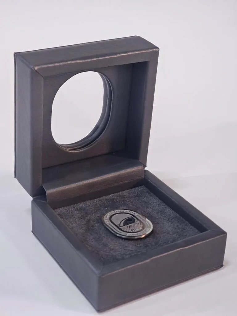
A foil stamped certificate with a blind emboss seal and a printed border, packed flat for issue.
Start with the stock
Weight and surface finish set the tone immediately. A heavy card with a slightly textured face behaves very differently under foil and emboss than a coated sheet, and it survives handling without showing fingerprints. We usually begin by asking how the document will be presented: handed over, posted or framed. Each of those routes asks something different of the sheet, and settling it early avoids re-specifying the stock halfway through the job.
Edges matter too. A clean guillotine cut reads as formal, and the sheet should sit flat rather than curl, so storage and packing belong in the specification as well as the artwork. We also decide how sheets are interleaved for packing, because a sheet that rubs against the one above it in transit loses the finish that was paid for. Flat packing with tissue between items is a small detail that protects the surface.
Finishing that signals authority
A small number of techniques do most of the work, and they combine without clutter when registration is tight. We normally shortlist two or three of them for a given document, because a page carrying all five looks busy rather than formal.
- Foil stamping for a seal, emblem or border that catches the light
- A blind emboss or deboss that gives the sheet a raised, tactile mark
- Sequential numbering printed in a contrasting ink or foil
- A fine guilloche-style border that is awkward to reproduce casually
- Spot UV on the emblem so it separates from the matte background
Any of these signals care, but the foil has to land exactly where it should. A seal sitting a millimetre off the printed circle undermines the whole effect, so we proof the finishing on the actual stock before the run begins. Blind embossing needs the same trial, because pressure that reads well on a light card can show through or mark the reverse on a heavier stock.
Layout and typography
Official documents share a few habits: generous margins, a clear hierarchy and one accent used sparingly. Type should be large enough to read comfortably and printed sharply, which points to offset or a high-resolution digital press rather than an office printer. Logos, borders and signature lines need breathing room, and the date and recipient fields should be planned from the start instead of squeezed in at the end.
A signature area deserves particular care. It needs enough clear space to be signed without crossing a border or a printed line, and the stock should take ink without feathering. If the certificate will be filled in by hand, we test the sheet with the pen or marker that will actually be used, because a beautifully printed surface is still frustrating if a signature smudges on it.
Printing, packing and issue
Finally, we treat certificates as controlled items. They are counted, interleaved with tissue where needed and packed flat so nothing creases in transit. If numbering runs sequentially, we check the print against the list before it leaves. Making a certificate look officially issued is mostly this discipline: the right stock, the right finish, careful registration and handling that respects the document after it comes off the press.
The Bottom Line
Confirm every choice on a physical sample before the run starts. Tell us what you are packing, how many you need and when you need it, and our team will come back with structure options, materials and pricing within a business day.