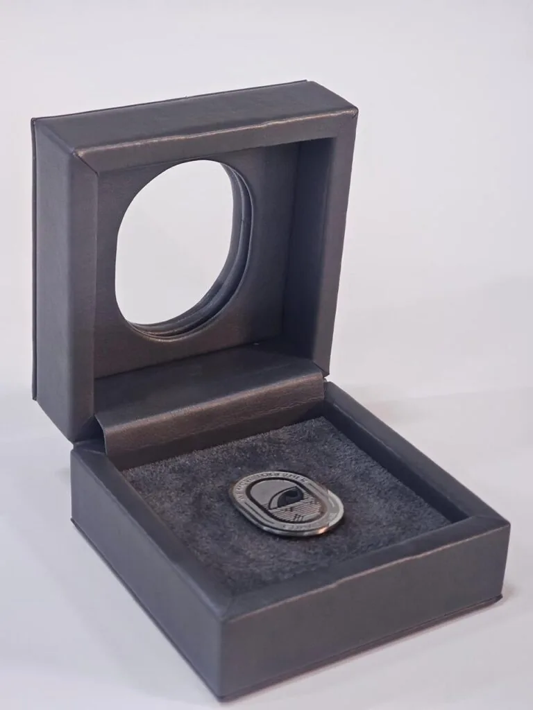

Dark and textured wraps are unforgiving because they do not return light evenly. Ink that reads as solid on a white sheet can look patchy on a deep or rough surface, and a screen proof gives you no idea what will happen. This is how we build colour that holds on difficult stock.
A dark textured wrap carrying a solid printed area with even coverage across the grain.
Why coverage behaves differently
Most inks are semi-transparent. On white board the light passes through the film, bounces off the sheet and comes back, which is why an ordinary print looks bright. On a dark wrap that returning light is absorbed, so the same ink film appears deeper and duller than it did on the proof.
Texture adds a second problem of its own. Where the surface rises, ink sits thinly and the board shows through; where it dips, ink pools and darkens. The result is a colour that looks uneven not because the press is out of adjustment, but because the material is not giving the ink a flat bed to sit on.
The depth of the base colour matters as well. A near-black wrap absorbs more than a mid-tone, so identical artwork needs a different build on each. That is why we ask for the exact material early rather than assuming artwork will transfer from one wrap to another unchanged.
The usual fixes
- A white underbase beneath the colour, so the ink has a reflective layer to sit on.
- A flood coat across the whole wrap first, with the colour printed on top of it.
- Higher solid density on the dark areas, judged on a physical proof rather than a screen.
- Simplified artwork: fewer tints and larger solids survive uneven surfaces better than fine screens.
Which route we take depends on the design. A logo in one or two colours may only need a white base and a heavier pass. A full-colour image on a textured wrap is a harder problem, and sometimes the honest answer is to reduce the tonal range in the artwork so the print has less to prove.
We also plan where colour sits relative to the grain. Running a solid across the direction of a textured wrap can exaggerate streaks, while artwork that follows the surface reads more evenly. It is a small choice on the dieline that pays back on the press.
Texture changes the artwork too
Fine type and hairlines behave badly on rough surfaces, because their edges break up where the weave or grain rises through the ink. We usually increase weight slightly and open up the counters before anything is printed, which keeps small text legible once the ink has landed.
Gradients are another weak point. A long tonal ramp on a deep background will show banding and mottling where the texture interferes, so we often replace ramps with a flatter treatment or move the transition to a calmer area of the design.
Prove it on the real material
A screen proof cannot represent absorption, grain or the way light breaks across a surface, so it is not evidence for this decision. We produce a proof on the actual wrap, judged in the light the box will be seen in, and you approve that before bulk production begins.
Check colour on dark and textured wrap from a distance as well as close up. Some unevenness disappears at arm's length; what does not disappear is what the customer notices, and that is the standard we hold the run to.
The Bottom Line
Confirm every choice on a physical sample before the run starts. Tell us what you are packing, how many you need and when you need it, and our team will come back with structure options, materials and pricing within a business day.