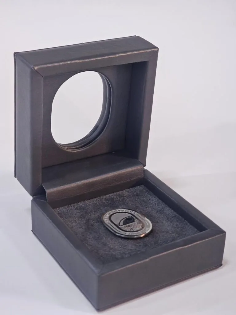

Giveaways that get photographed are not the ones with the most effects on them. They are the ones that stay legible when a phone camera compresses the image, overhead lights flare across the lid and the box is cropped to a square. Designing for that moment is a material decision before it is an artwork decision.
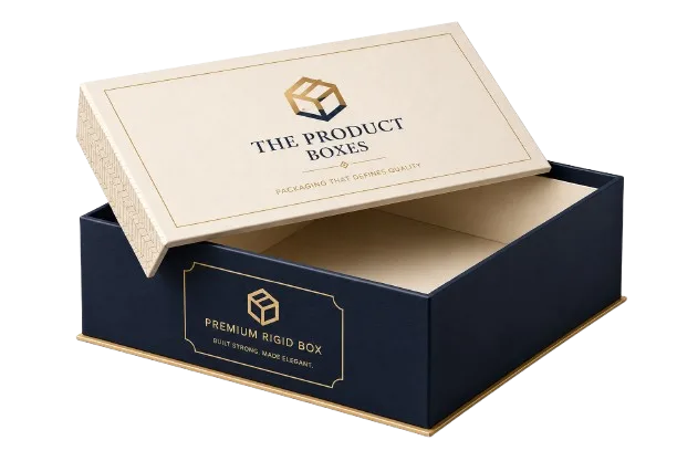
A rigid giveaway box with a single strong logo and clean edges reads clearly in a phone photograph taken under office lighting.
Bright light exposes every shortcut
Gloss lamination reflects whatever is overhead, so a logo sitting in the middle of a shiny panel can vanish under a strip light. Soft-touch and matt lamination absorb light instead, which keeps the surface readable but flattens a metallic mark. The safe pattern is a matt ground with one glossy or metallic element placed away from the reflection line.
Background colour matters as much as the finish. A dark lid holds its edges in a photograph and gives pale ink something to push against, while a pale stock lets deep ink and a single accent carry the frame. Busy patterns are the usual failure: they look lively on screen and turn into visual noise at thumbnail size, which is where most people first see the item.
One focal point, plenty of quiet space
A camera shrinks everything before anyone reads it, so the logo has to work at roughly a quarter of its drawn size. Thin strokes fill in, outlines close up and small type becomes a grey line. Give the mark room, keep the panel around it empty and let the structure provide the second layer of interest.
- Logo scale: if it will not read as a thumbnail, it will not read in the post either.
- Stroke weight: hairlines and fine counters disappear when a phone softens the edge.
- Contrast between finish and board, so the mark separates rather than sitting flush with the ground.
- One accent colour used with discipline, instead of several competing under mixed lighting.
- Quiet edges and corners, where cropping usually takes its cut.
Materials that photograph honestly
Uncoated and textured wraps show their grain on camera, which reads as quality in close-up and as dirt in a wide shot. Coated stocks stay clean but show every fingerprint and glue line during packing. Spot UV gives a controlled contrast on a matt ground and survives cropping well, because the effect is a difference in surface rather than a difference in colour.
Colour behaves the same way. Process builds are fine for most artwork, but a brand red or a brand blue can drift once it sits beside a warm light and a camera white balance. Specifying a Pantone reference for the one colour that has to match across the box, the sleeve and the card is cheaper than correcting it after the giveaway has been distributed.
Design for the crop and approve in hand
Think about how the item will be framed before the artwork is signed off: a square crop, a caption along one edge, a background it will sit against. A box that reads in silhouette, with a lid, a drawer or a clean band across the middle, gives the photograph a shape even when the logo is partly out of frame.
We ask where the item will be photographed and then build the sample to that light. Samples are approved before bulk production, and it is worth photographing the approved sample under the lighting the post will use. That single step is what separates giveaways that get photographed from the ones that end up in a drawer.
The Bottom Line
Confirm every choice on a physical sample before the run starts. Tell us what you are packing, how many you need and when you need it, and our team will come back with structure options, materials and pricing within a business day.